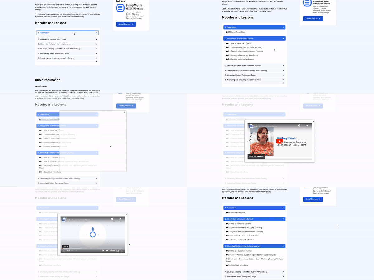
Course Filter Feature
Designed & implemented
a course filtering system
Objective
Design, update, and implement a new training and course filtering system, enabling users to easily find and select relevant courses based on their preferences and needs.
Timeline
2 weeks for implementation and updating of all filters and article content.
Company Context
Rock University provides courses to help clients become experts in the Ion platform, a web builder focused on creating interactive content.
This category details the step-by-step approach taken during the project, including research, planning, design, development, testing, and optimization phases.
Research & Planning
Analyzed the old filtering system and collaborated with a developer to create new JavaScript for integration into the page builder.
Design & Prototyping
Designed a mini course filter section on the landing page for improved accessibility and incorporated internal pop-ups for course videos, eliminating the need to link to third-party websites.
Implementation
Implemented the new page script and applied specific rules to each filter card, ensuring accurate filtering.
Testing & Optimization
Conducted internal testing of the filters, making adjustments based on feedback to enhance functionality.
The new filtering system allows for more precise content browsing and reduces search time. Internal pop-up videos ensure users remain on the same page, maintaining a seamless experience.
Landing Page Filter
Highlights top courses offered at Rock University to engage users.
Content Page Filter
Improved layout for easier navigation.
Video Pop-up
Course videos are accessible within the same page, without redirecting to external sites.
Here, the outcomes and achievements of the project are highlighted, including user feedback, adoption rates, and industry recognition.
Increased Efficiency
Users reported significant time savings and enhanced productivity with the new layout and features.
Positive User Feedback
Higher satisfaction ratings and positive reviews highlighted the intuitive design and improved user experience.
Decreased Bounce Rate
Users were less likely to leave the experience after viewing a few courses, thanks to the elimination of third-party redirects.
Improved User Retention
The internal pop-up feature kept users engaged on the course pages, reducing drop-off rates and enhancing the overall user experience.


